How to Make a Good PPT: Layout, Fonts and Slides
A good PPT is not about fancy designs. It is about one clear message, a few slides that support it, and text people can read from the back of the room. Here is a method that works for college seminars, office reviews and business pitches.
Step 1: plan on paper first
Write down who is listening, what you want them to do at the end, and three to five points that lead there. These points become your sections. A 10-minute talk needs about 6 to 10 slides. If you have 25, you are reading, not presenting.
A story that fits most talks: situation → problem → solution → proof → ask. For a project: what we studied, what we found, what it means, what we recommend.
Step 2: write headline titles
Each slide's title should be a full sentence that states the point.
- Instead of *Results*, write *Delivery cut customer complaints by half*.
- Instead of *Market*, write *Most buyers are 25 to 40 and order on their phones*.
Read only the titles from start to end. If they tell the story, your structure is right.
Step 3: layout and fonts
- Use the built-in layouts (Home → New Slide) so titles and text sit in the same place on every slide.
- Set fonts once in the Slide Master (View → Slide Master). One font family, such as Calibri or Arial.
- Sizes: titles 32 to 40 pt, body 20 to 28 pt. If you need smaller text, split the slide.
- Six lines or fewer per slide, no paragraphs.
- Contrast: dark text on a light background or white text on dark navy.
Step 4: charts and pictures
Use one colour for all bars and a second colour only for the bar you are talking about. Delete gridlines and extra decimals. Pictures should explain something, not decorate. Align boxes and icons (Shape Format → Align) so nothing looks slightly off.
Step 5: animations, lightly
One transition for the whole deck, such as Fade. Use animation only to reveal points one at a time as you speak. No spinning text, no sound effects.
Step 6: rehearse once out loud
Write notes under each slide and run the deck in Presenter View with a timer. Most people find they are two minutes over and cut a slide. That is a good thing.
Mistakes that make PPTs boring
Reading the slides aloud, too many bullet points, tiny fonts, different designs on every slide, and ending on "Thank you" without saying what you want next. End with your ask and contact.
To save time, our PowerPoint Course + 25 Slide Templates gives you 12 short lessons and 25 ready layouts for seminars, interviews and pitches.
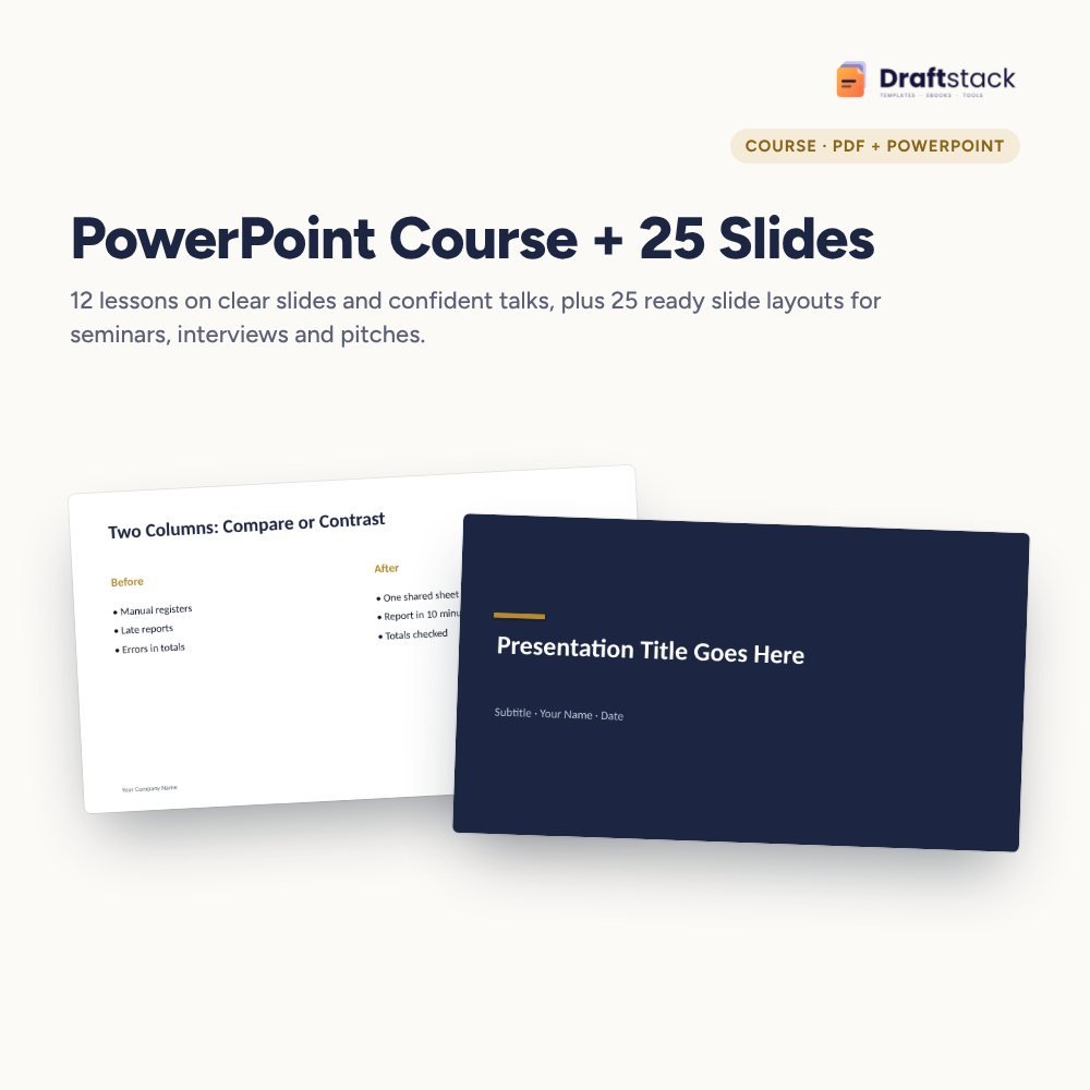 The template from this guideMS PowerPoint Course + 25 Slide Templates
₹262
 WhatsApp
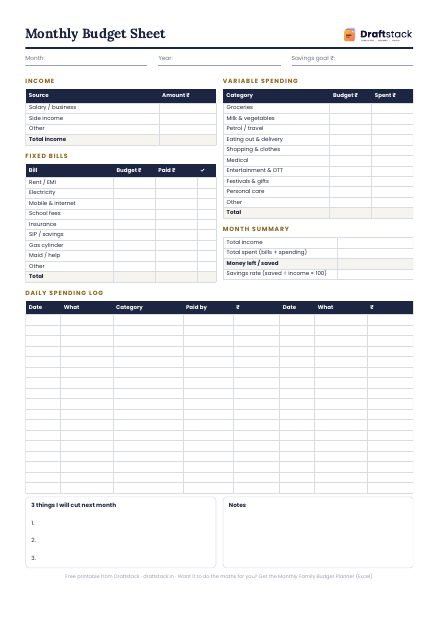
Free Monthly Budget Sheet
A printable one-page budget sheet: income, fixed bills, daily spending and savings for the month. Print it or fill it on your phone.
More guides
15 MS Word Skills Every Office Job Asks For
The Word skills that interviewers and managers expect from office staff, explained simply, with the shortcut or menu for each one.
Pivot Tables Explained with an Indian Sales Example
What a pivot table is, how to build one in two minutes from a sales register, and the five settings that turn it into a monthly report.
How to Learn Excel in 30 Days: A Day-by-Day Plan
A realistic 30-day plan to learn Excel from zero to pivot tables and dashboards, with what to practise each day and the mistakes that slow people down.